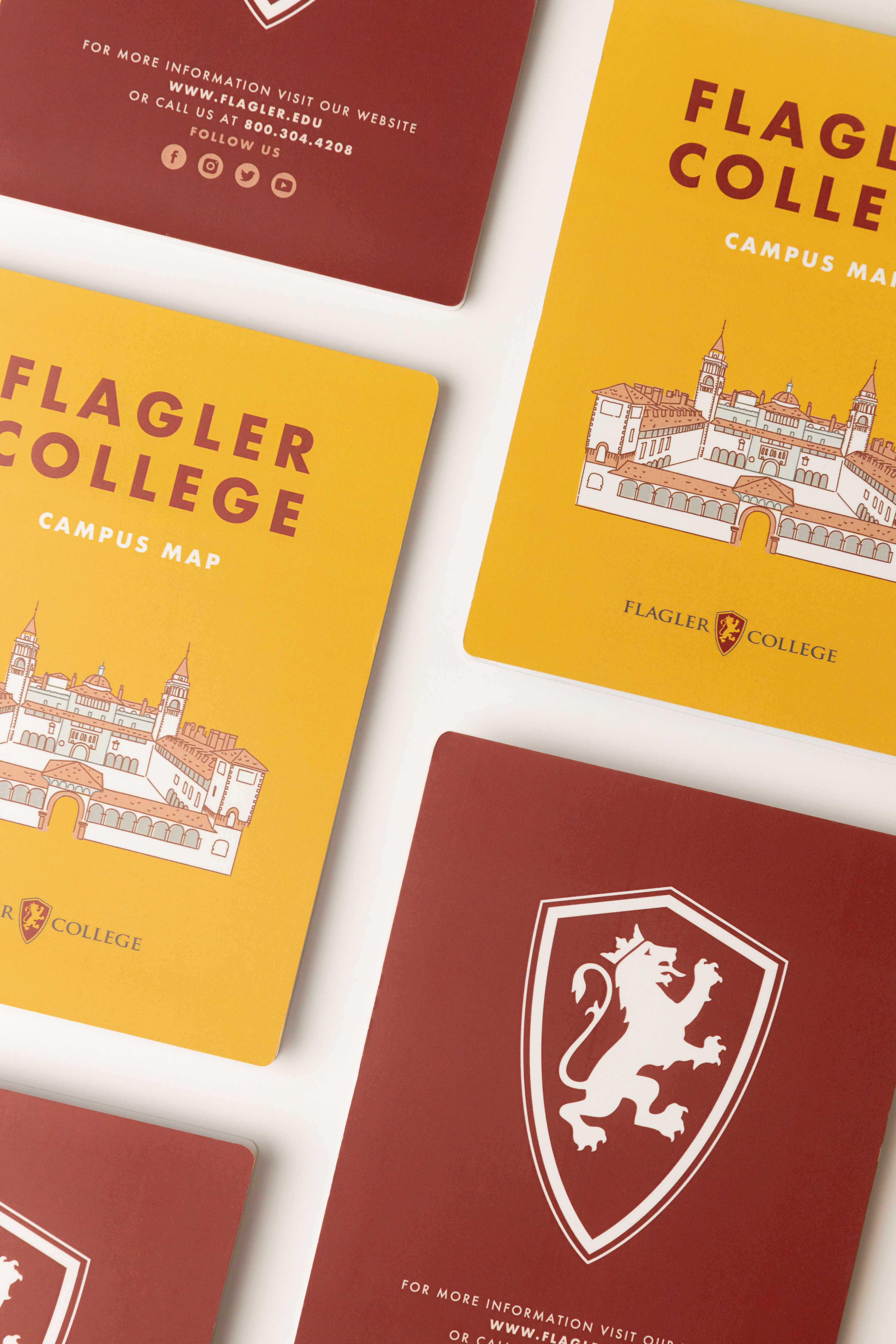
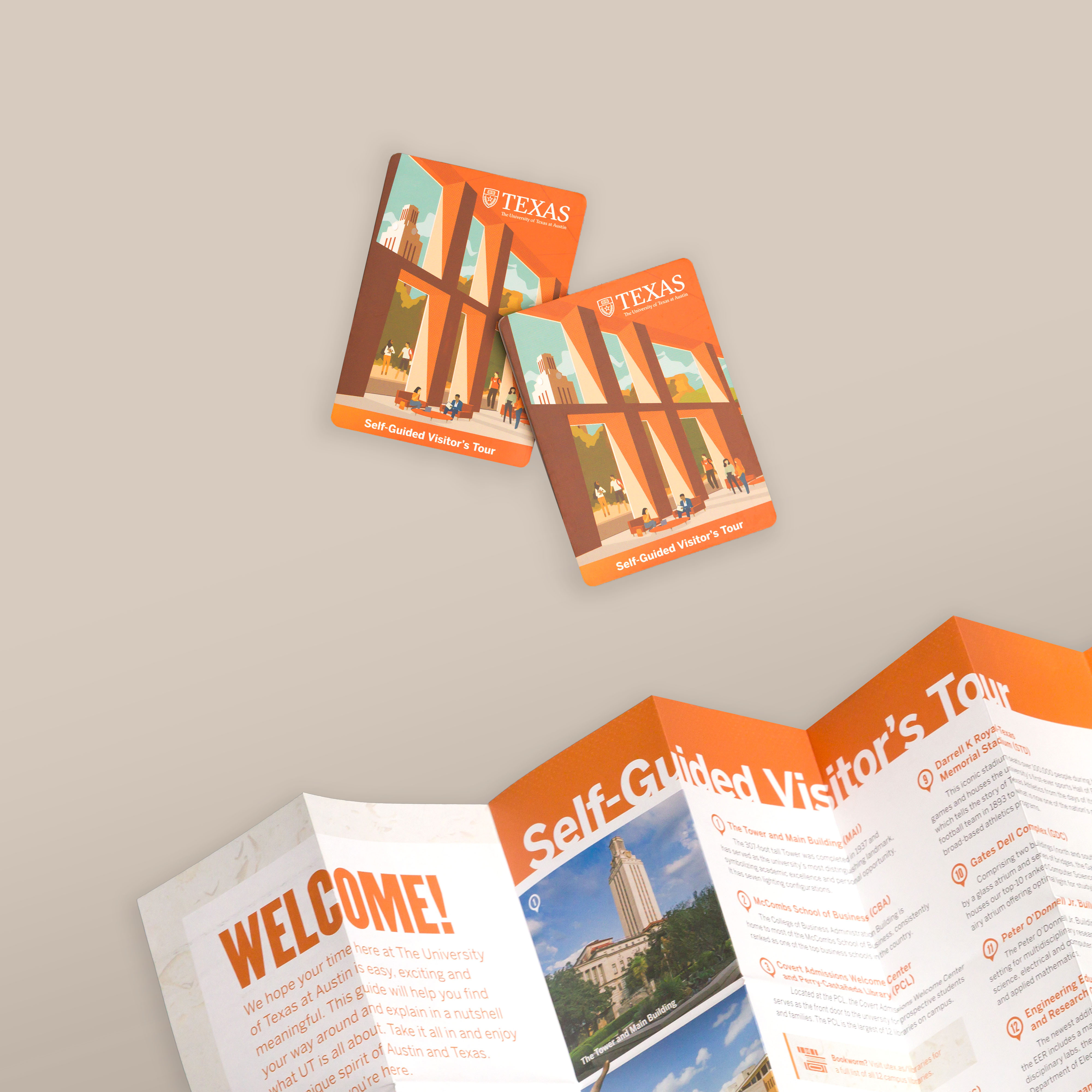
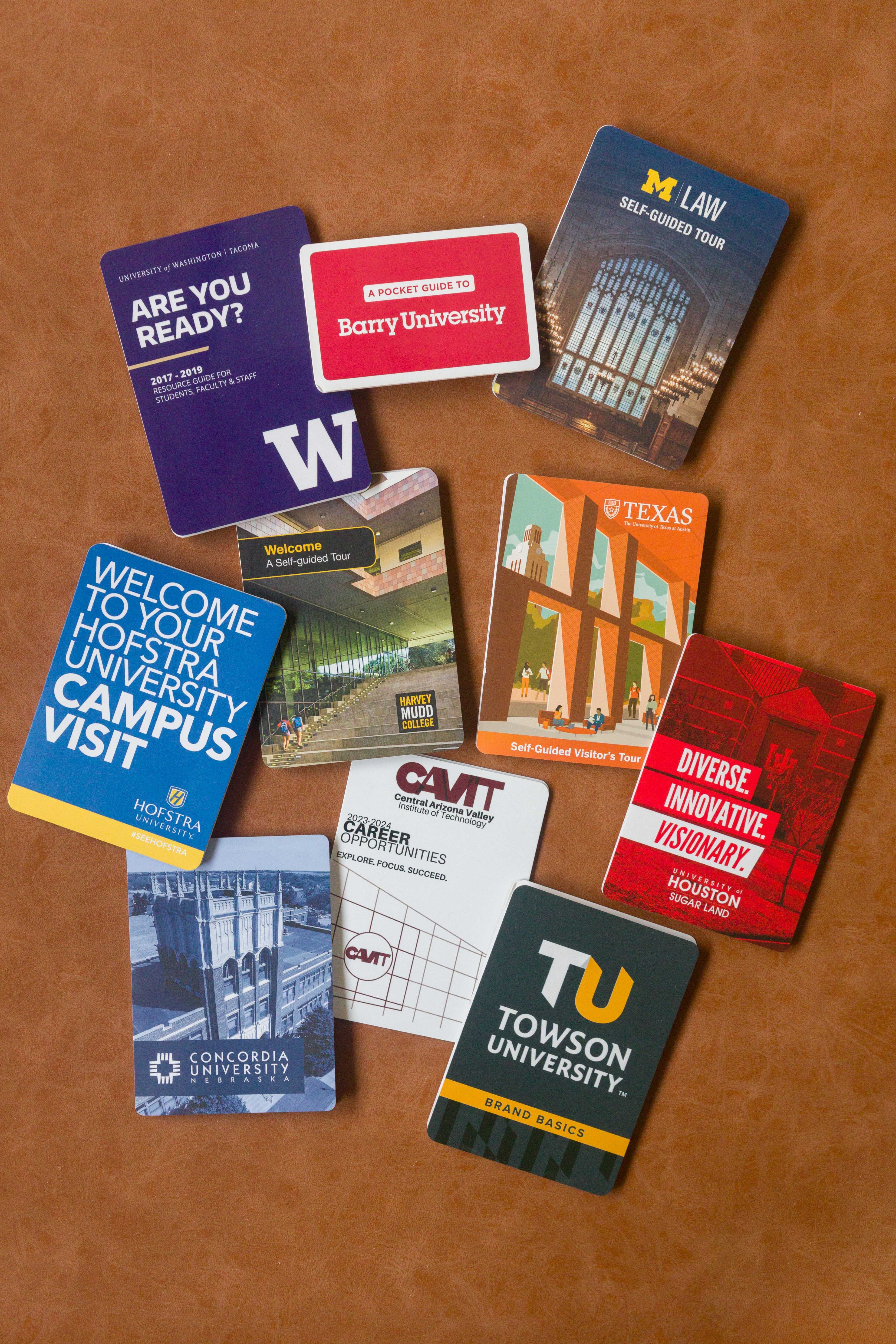
The top 5 tips to include on your Campus PocketMaps
- Folding Maps
- Campus Wayfinding
- Campus Maps
- University Map
On any college or university campus, it's essential to be able to carry a map of the school around or see it prominently displayed in a relevant area.
However, when creating or upgrading a campus map, it can be overwhelming to think about what details to include, and what details you should leave out.
So what can make your map the most successful wayfinding tool for new students and their parents? Here's our guide of 5 tips and considerations to include on your campus pocket map.
1. Visually plan your map with your goal.
The first thing every map must have is a goal. That goal usually relates to knowing and targeting the right audience. Most communications directors and college admissions offices know that the majority of map users will be a new perspective, and new students and their parents are visiting the campus for the first time. Therefore, the map should focus on providing and highlighting key features that are pertinent to this demographic. However, a map might want to highlight different features for grad students at a university, or new staff and faculty. As always, there can be multiple reasons or uses for your map, but it's best to start with the most significant or primary purpose when it comes to the basic design.
So, the first questions you should ask before you start designing your map include:
Who will be using your map?
What features will be the most important to these users? What landmarks do students congregate around, no matter their status (new student or senior)? These questions will help you direct your focus for your map
2. Highlight larger departments and institutions first.
Now that you have a purpose and goal in mind, you can now focus on what design considerations you should take.
In general, it's best to err towards simplicity versus providing too much detail. Too many labels or keys can saturate the map and make it harder for students to find particular places, especially if they are in a rush. Therefore, emphasize buildings and principal offices or institutions first--like the campus bookstore, dining hall locations, the library, and the gym--before getting to smaller offices that might not be on a student's priority.
For those small but essential offices in more significant buildings, having a particular symbol to indicate its location can be immensely helpful to students.
For example, maybe the class registration office doesn't have an actual building, but is tucked away in an administration building: putting a symbol down on that building with a note to the side can help students avoid searching through a directory of numbers and names.
Also, keep in mind how building directories can help students find their way. When designing your campus map, consider how they can work in tandem with building lists or maps. Knowing that there are supplemental guides, and how they look or work, can help you make an informative map that's not too busy.
Having temporary wayfinding signs placed strategically around large campuses can also help guide new students as they grow more familiar with the grounds.
3. Provide a parking guide.
Parking can be critical to a campus map, especially when a good portion of students live off-campus and commute. A color parking code for registered students, visitors, and staff and faculty will help students quickly understand which lots are off-limits. Also include a note about registration, emphasizing how vital preregistration is if students do not want tickets their first week. By addressing parking from the get-go, you can minimize congestion.
4. Put your campus in context with the broader environment.
Your campus is not the only component that students are looking at when they are picking among colleges or universities. They are also questioning the type of environment the school connects to, and how it can support or hinder their social life or their career moves. Your campus map should also highlight these features, making the connection between being on and off-campus visible.
For example, the Pioneer Valley in Western Massachusetts has a unique 5 College consortium, connecting the five major colleges and universities in the area through a simple bus system, cross-campus courses, and clubs and activities. If your college or campus has a special relationship with other colleges, it's important to highlight it in some way to boost the image. Having a map that can prominently display the bus stops to these colleges helps students understand how integral off-campus connections are and can generate a great conversation about what this relationship means to campus life.
Besides, you don't have to build a large map that will also include landmarks outside the campus, but you could consist of wayfaring signs to larger monuments. For example, a campus-like Georgia Tech is right in the thicket of Atlanta's city scene, with significant city landmarks like the Aquarium close to campus. An arrow pointing the direction to significant landmarks can help a map user visualize where they are on campus concerning the city, and helps them realize how integrated the campus is to the larger city. A small blurb on the side or back of the map that indicates nearby attractions can help emphasize that connection.
5. Provide connections to online material.
Print maps are a great way to introduce a prospective student or parent to the campus, but at the end of the day, it's essential to make sure that the map works in tandem with your larger marketing strategy. That's why you should add a small section dedicated to your online persona, making it easy for students to take the map away and use it as a gate to your online pages.
In addition to a list of social media handles for your admission office's Twitter, Facebook Page, Instagram can create individual QR codes that will jump prospective students to a current student testimonials page or even the application page for the college.
If you already have a particular social media campaign involving hashtags (such as #firstyearstudent or a tag related to a specific event), add it to your map! That way, your map works in two distinct yet connected components of your communications office.
If you already have an online map that is sufficiently detailed, you can also connect it to your print map with a link or search tag to direct students there. Overall, consider your map as a gateway to larger pages of information to help students get around and comfortable with your campus.
By following these five tips, you can help build a better campus map to direct new students with ease. For more help with designing or printing the perfect pocket campus map, contact us. We would love to help you take the next step.


