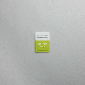
5 Mistakes to Avoid When Designing a Custom Map
- Folding Maps
- Map design
- #graphic design map ideas
- #map design
- #paper map design
5 Mistakes to Avoid When Designing a Custom Map
A well-designed map can transform how visitors experience your destination.
However, a poorly designed one can cause confusion and frustration, and even deter people from visiting the places you want them to.
In this guide, we’ll cover the most common mistakes to avoid when designing a custom map and how to ensure your project gets it right from the start.
1. Overcrowding the Map with Too Much Information
When it comes to maps, less is more.
Trying to cram in every restaurant, bathroom, trail marker, and souvenir shop can overwhelm your visitors.
Focus on:
Landmarks and key destinations
Major pathways and routes
Helpful extras (like parking lots, trailheads, or scenic overlooks)
A clean, focused design helps users quickly find what matters most.
2. Using Fonts That Are Too Small or Hard to Read
Beautiful design doesn’t matter if your visitors can’t read it.
Avoid:
Tiny typefaces
Overly stylized or decorative fonts
Poor contrast between text and background
Pro tip:
Always prioritize legibility, mainly if your map will be used outdoors, in low light, or by older audiences.
At PocketMaps, we test every design for readability at real-world sizes.
👉 Learn more about our design services here.
3. Ignoring the User’s Natural Flow
A good map should match how visitors actually move through your space.
People get frustrated if pathways, entrances, or key attractions aren’t laid out logically.
Tips for success:
Start with the main points of arrival and departure
Emphasize logical paths and natural routes
Consider how people will hold or view the map (especially folded versions!)
Good map design mirrors real-world navigation.
4. Using Confusing or Inconsistent Icons
Icons are supposed to make maps easier, not more complicated.
But when icons are inconsistent, unclear, or overly artistic, they confuse visitors instead of helping them.
Keep it simple:
Use familiar, universal symbols (parking "P", restroom icons, dining utensils)
Stay consistent with size and style
Include a legend or key if needed
At PocketMaps, we create custom icons when needed but prioritize clarity first.
5. Forgetting About the Printing and Folding Process
Designing a beautiful map digitally is only half the battle.
You also have to plan for printing and folding.
Common printing mistakes:
Ignoring safe margins (critical for folding maps)
Forgetting about bleed space
Choosing paper that isn’t durable enough for how the map will be used
Designing layouts that fold awkwardly or hide important information
At PocketMaps, we handle both design and printing to ensure that your final map looks fantastic and functions perfectly from screen to hand.
Quick Recap: Avoid These Common Map Design Mistakes
✅ Keep your layout clean and focused
✅ Prioritize easy-to-read fonts and labels
✅ Match the design to real-world navigation
✅ Use clear, consistent icons
✅ Plan your design with printing and folding in mind
Ready to Design a Map That Gets It Right?
At PocketMaps, we help you avoid the common pitfalls and create maps that visitors love to use.
From early design sketches to final bulk printing, we make the process smooth, creative, and stress-free.
👉 Start your custom map project with PocketMaps today.
Let’s create something visitors will thank you for.